2016
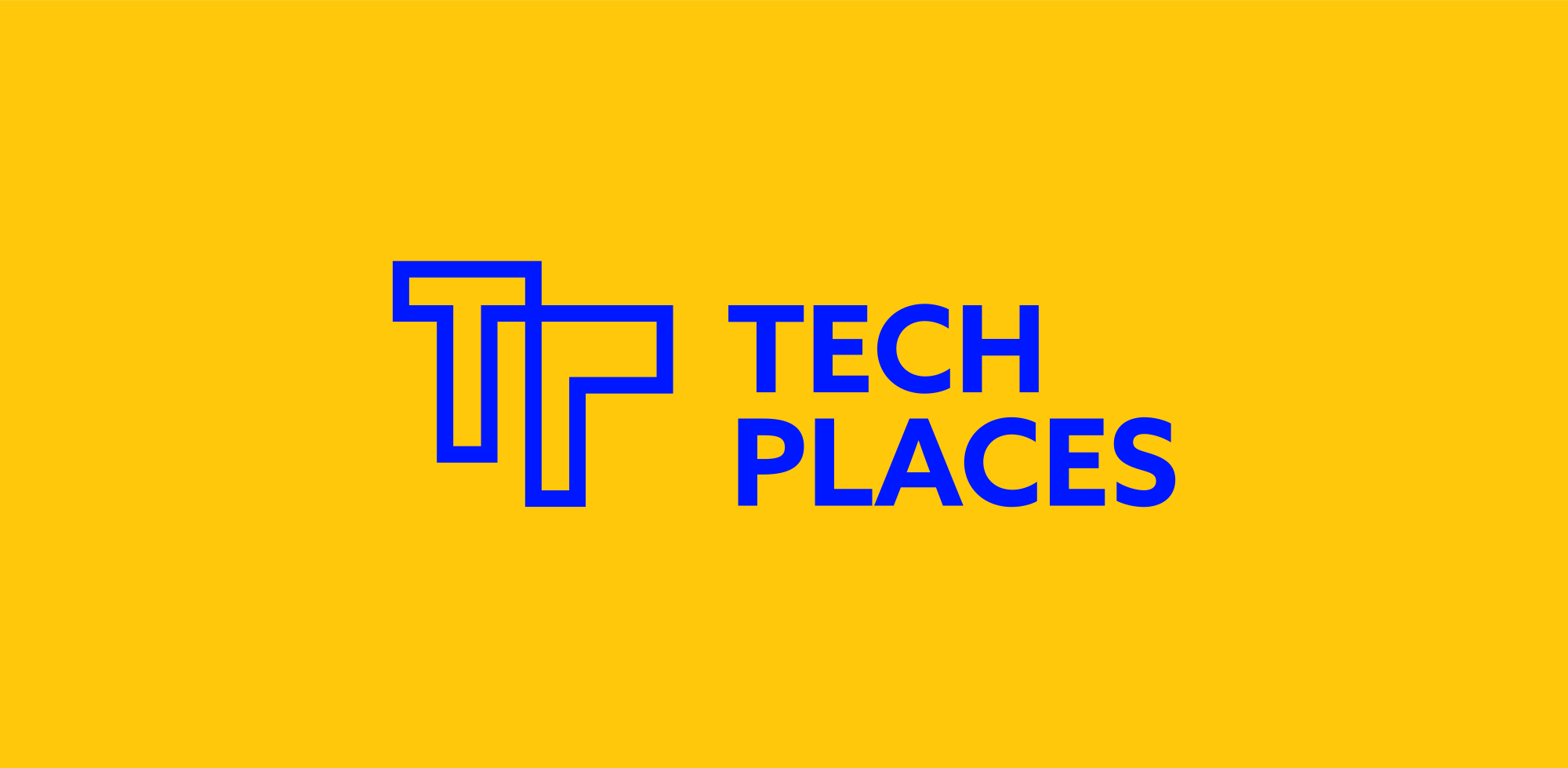
Techplaces Visual Identity
Reseau des cantines, a large network of coworking spaces and tech hubs in France, rebranded into Techplaces.
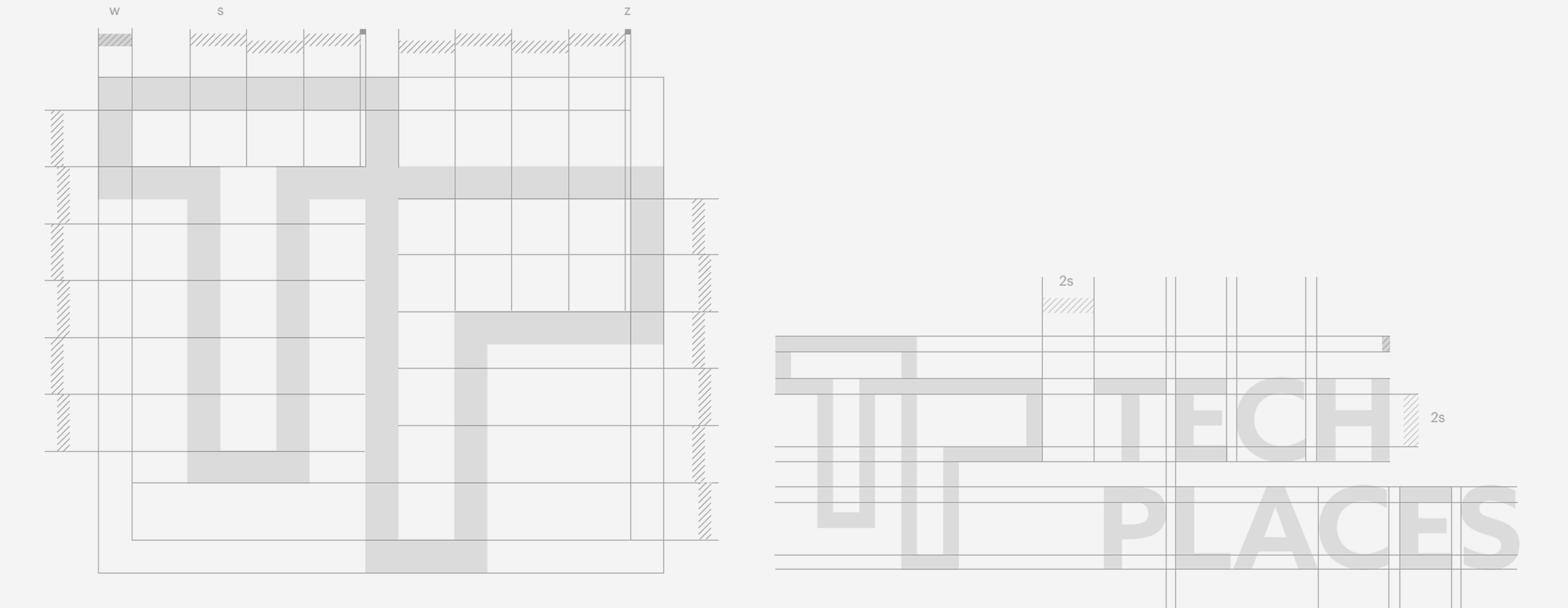
Geometry
The logo is made for mass usage therefore the aesthetics are optimized for easy recognition. It is highly readable in small and large sizes, uses a bold uppercase font and is non color dependent.
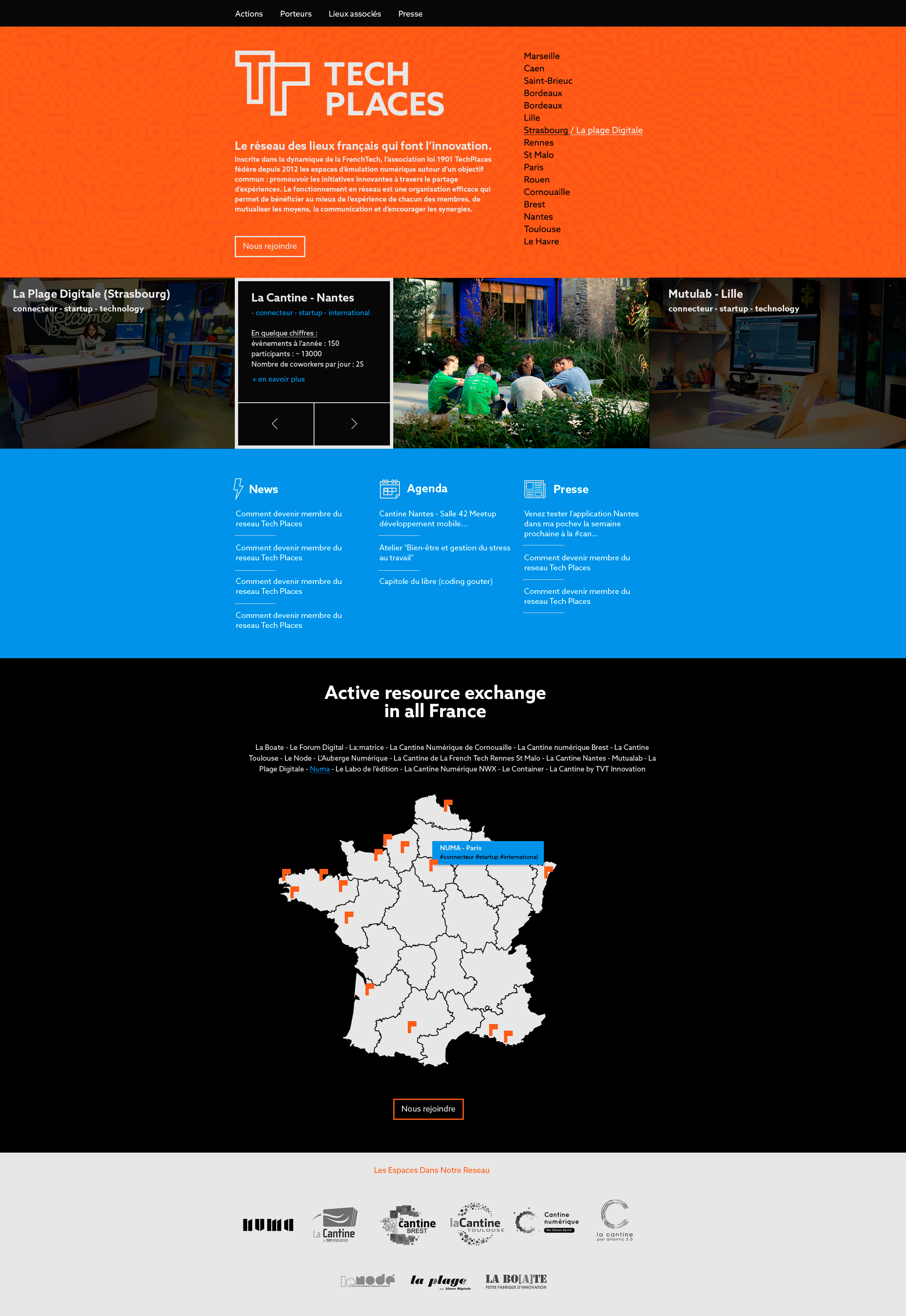
Website
The concept further evolved by putting the logo in the context of a website layout.